I spend time on the MDSN Site, particularly the MSDN Library sub-site where I’ve added a few PowerShell scripts as well as editing the content that is added. Just recently, the site has had a bit of a make over. The “MSDN-RED” logo is replaced wiht a more stylish blue colour, along with the opportunity to change your view of the site.
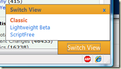
From FireFox, I have a new pop up at the bottom right hand corner of my browser window:
The “old” view, Classic is what you are used to, although with new colours. It is the view I will use going forward. Lightweight beta provides what it says, a much more lightweight feel. ScriptFree is even nicer (IMHO) to look at. And being smaller pages, download times are much snappier.
But what both these two new views omit is all the community contnet (i.e. Community Content) as contained in Classic View. From the Script page, community added page tags are R/O, and there appears to be no way to see or edit Community Content (from both LightWeight and Script Free skins). And the big orange Switch View button from Classic view is pretty ugly and distracting – worse, there appears to be no way to tell it: I’m happy with what I see and please go away. Or at least a more subtle control perhaps in the title bars like in the other views.
For casual users, or those on lightweight (aka celluar) networks, it’s a nice touch. Shame about losing the community content.

No comments:
Post a Comment